
Trying to make sense of what’s happening in the financial markets and the economy?
The following analysis and nine accompanying charts from Charlie Bilello, Founder and CEO of Compound Advisors, go a long way in making sense of what we’re witnessing with stocks, investor sentiment, bonds, the economy, the consumer, earnings, housing, and more.
**
Nine charts that tell an interesting story in markets and investing.
All data as of May 4, 2022.
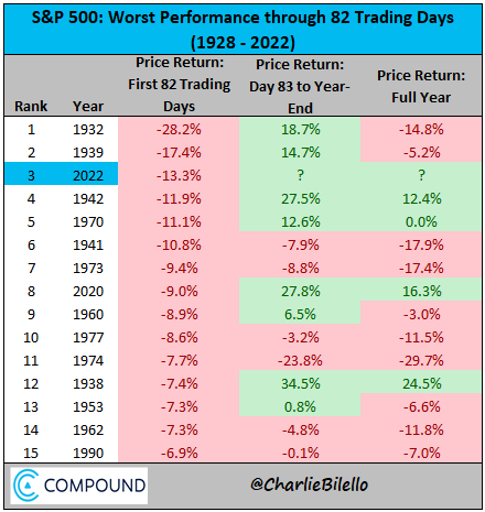
1) Hard Times
The S&P 500 declined 13.3% in the first 82 trading days of 2022, the worst start to a year since 1939. Remarkably, the S&P 500 is down more this year than we were at the same point in 2020 (-9.0%).
The Nasdaq Composite (>50% of index is in Tech) declined 13.3% in April, its worst month since October 2008 and the 12th largest decline since its inception in 1971.
What stands out in terms of forward returns after large declines?
Continued volatility to come.
As to what direction, that appears to be a coin flip in the short run.
But as for longer-term returns over the subsequent five years, they are mostly positive, with only the 2000 data points showing declines (Nasdaq bear market started in March 2000 bottomed in October 2002 after a nearly 80% decline).

Where will the Nasdaq bear market market bottom?
Here are the results of a recent poll.

2) No Place to Hide
With data going back to 1976, this is the first time ever that both US stocks and bonds are in a drawdown greater than 10% at the same time.
The S&P 500 is in a 13% drawdown while bonds are 11% below their 2020 high.
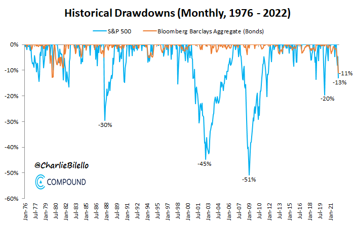
The last eight times the S&P 500 was down in a calendar year, bonds finished the year up, cushioning the blow.
It’s been a very different story thus far in 2022.
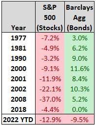
The result: by far the worst start to a year for a 60/40 stock/bond portfolio in history…

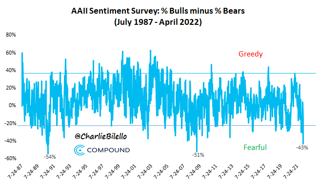
3) The Bears Are Back
Not surprisingly given the carnage, the Bears are back, outnumbering Bulls by 43% in the latest AAII sentiment survey.
With data going back to 1987, the only other times we’ve seen sentiment this bearish.
1) Sep-Nov 1990 (-20% bear market that bottomed in Oct 1990 with a recession in 1990-1991)
2) March 2009 (week of the bear market lows)
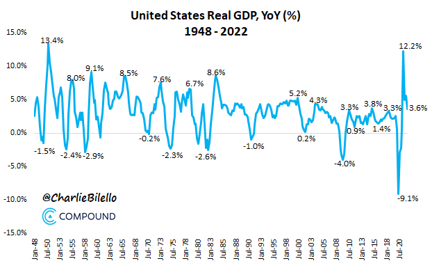
4) Slowdown or Recession?
That’s the question everyone is asking after US Real GDP contracted 1.4% during the 1st quarter of 2022 (annualized rate).
Does a negative quarter mean we are definitely entering a recession?
Not necessarily.
We’ve seen Real GDP fall a few times in recent history with an expansion remaining intact…
- Q1 2014: -1.4% (expansion didn’t end until February 2020)
- Q3 2011: -0.2% (expansion didn’t end until February 2020)
- Q1 2011: -1.0% (expansion didn’t end until February 2020)
Real GDP was still up 3.6% year-over-year year-over-year (YoY) versus an average YoY growth rate since 2000 of 2%.
In most recessions (but not all – see 2001) this number turns negative.
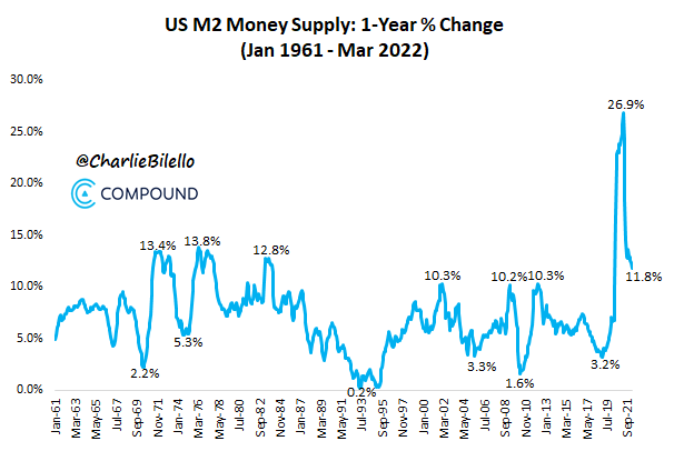
5) The Aftermath of Money Printing
The US Money Supply has increased by over 50% in the last 3 years, the largest three-year increase ever.
The only other times when Money Supply increased by >40% in a three-yr period: 1973 & 1977-78.
Both were followed by high inflation, recessions (1973-75, 1980, 1981-82) and bear markets.
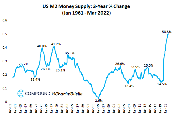
Initially everyone loves printing money as the results only seem positive (booming stocks/housing/economy).
But inevitably, the pernicious effects of inflation are revealed and a choice has to be made: print more or end the party before it’s too late.

We’ve just recently chosen the latter, with Joe Manchin drawing a line in the sand (no more big spending bills) and the Fed ending quantitative easing (QE), and zero interest rate policy (ZIRP) with a move towards normalization.
The M2 rate of change is now slowing rapidly.
In the short run this will be painful but it’s the only path to long-term prosperity.
6) Earnings Pullback
After four straight record quarters, S&P 500 earnings pulled back in Q1 (-13% vs. Q4 2021) with the year-over-year growth rate moving down to 3%.
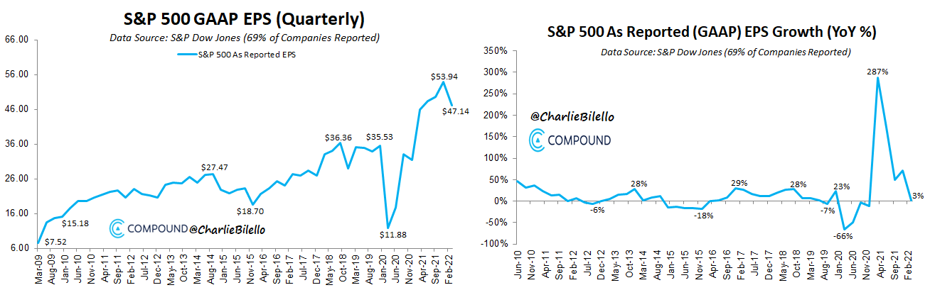
Among the largest and most influential companies, we’ve seen a sharp deceleration in growth, with Netflix, Amazon, and Facebook all posting their lowest revenue growth rates in company history.

7) The High Growth Repricing Continues
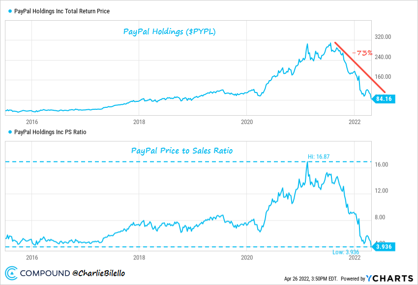
PayPal ($PYPL) is now down 73% from last year’s high, its largest drawdown to date.
Last year investors were happy to pay 17x sales for PayPal, its highest multiple ever.
Today they can’t sell the stock fast enough at less than four times sales, its lowest multiple ever.
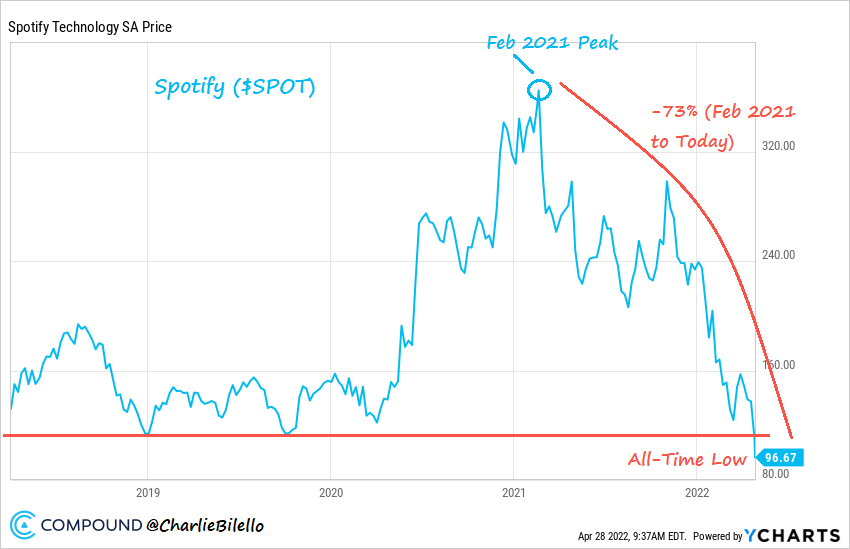
Spotify ($SPOT) shares hit an all-time low after earnings, down 73% from their peak in February 2021.
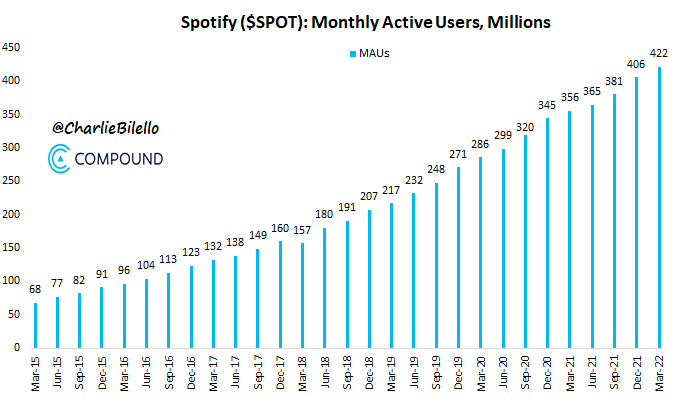
Spotify had 157 million monthly active users when it went public in April 2018.
Today (four years later) it has 422 million, an increase of 169%.
Revenues have more than doubled during this time.
And the stock? It’s 35% below where it closed on its first day of trading in April 2018.
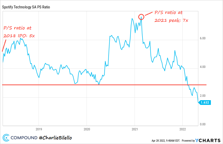
What happened?
A repricing of its shares, from five times sales at its IPO to 1.6x today.
A year ago it was trading a significant premium to the market (seven times sales vs. three times for the S&P 500) and today it trades a significant discount (1.6 times vs. 2.7 for the S&P 500).
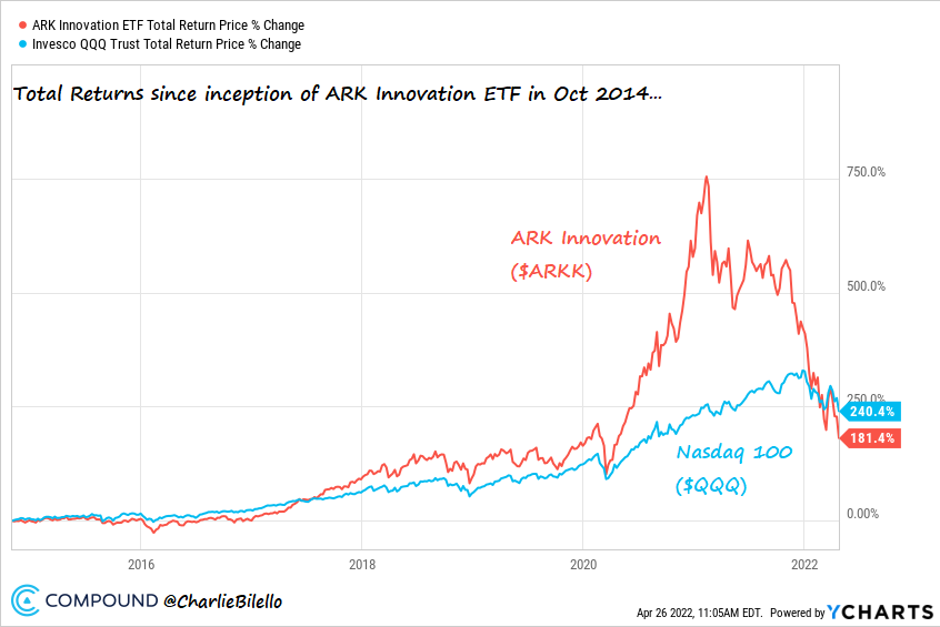
The largest active growth fund, ARK Innovation ETF ($ARKK), is now underperforming the Nasdaq 100 by 60% since its inception in Oct 2014.
In February 2021 it was outperforming by 500%.
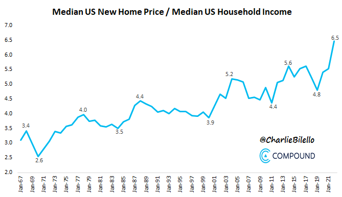
8) Unaffordable Housing
The median price of a new home in the US is now six times higher than the median household income.
Housing has never been more unaffordable relative to incomes.
Here’s a look at the average price of a new home in the US over the last decade…
- 2012: 284k
- 2013: 300k
- 2104: 332k
- 2015: 349k
- 2016: 359k
- 2017: 384k
- 2018: 369k
- 2019: 373k
- 2020: 375k
- 2021: 415k
- 2022: 524k (+26% YoY)
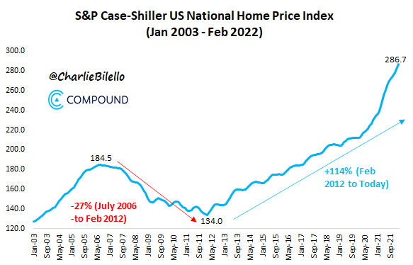
US home prices hit a record high in February for the 37th month in a row.
Prices have increased 20% over the last year and more than doubled over the last 10 years.
9) The Great Normalization
As painful as it’s been for bond investors, the spike in yields thus far in 2022 has merely been a normalization.
Yields were artificially low due to the Fed’s excessive monetary manipulation and are now moving towards a market-based rate.

**
Related stories: Eight Extreme Charts to Make You Question Your Assumptions